Fusedash vs StatPecker
Side-by-side comparison to help you choose the right tool.
Fusedash transforms raw data into clear dashboards and charts for instant team insights and action.
Last updated: March 4, 2026

StatPecker
StatPecker transforms your data into secure, stunning visuals for instant business insights and content.
Last updated: March 1, 2026
Visual Comparison
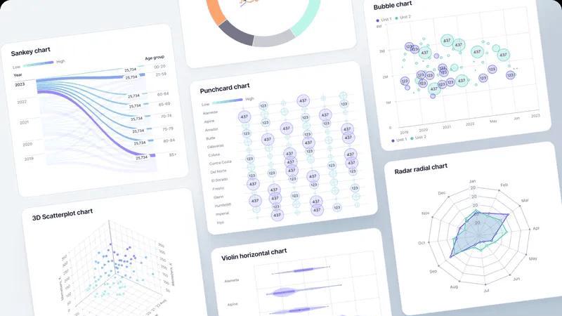
Fusedash
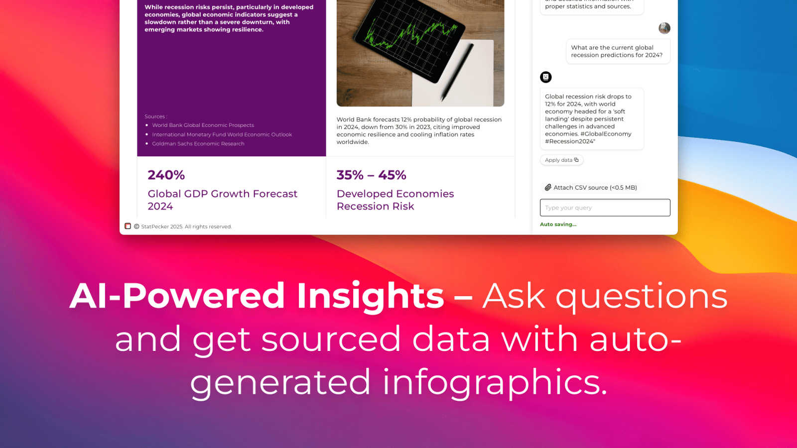
StatPecker
Feature Comparison
Fusedash
Unified AI Visualization Workspace
Fusedash consolidates the entire data reporting workflow into one intuitive environment. Instead of juggling separate tools for dashboards, charts, maps, and reports, teams can create all these views from the same connected dataset. This unified approach means you build your data logic and KPIs a single time, then deploy them across interactive dashboards for monitoring, detailed charts for analysis, narrative reports for stakeholders, and even real-time monitoring interfaces. The platform's flexibility allows for custom layouts, filters, and time ranges, ensuring each audience gets the precise view they need without duplicating effort or compromising data consistency.
AI-Powered Chart Generator
This feature accelerates the initial step of data exploration and presentation. Users can instantly generate clear, accurate visualizations by simply uploading a CSV file or connecting to an API. The AI assists in selecting the most appropriate chart type for the data, applying meaningful comparisons, and refining labels to ensure the visual tells the correct story. These AI-generated charts can serve as powerful standalone visuals for quick reports or be seamlessly integrated into larger, more comprehensive dashboards, providing a fast track from raw data to understandable insight.
Intelligent Data Chat & Exploration
Fusedash incorporates a conversational AI interface that allows users to interact with their data using plain language. When unsure where to begin or needing a specific breakdown, users can ask questions like "What were sales by region last quarter?" or "Show me a breakdown of user churn by plan." The smart chat interprets these queries, explores the data, and provides suggested metrics, charts, and visual breakdowns. Crucially, these insights can be instantly transformed into permanent, shareable dashboard views, making advanced data analysis accessible to every team member regardless of their technical expertise.
Flexible Data Integration & Management
The platform is built to handle diverse data sources with ease, eliminating the need to rebuild analyses across different systems. Users can upload static CSVs, connect live data via APIs, and even enrich their views with relevant public datasets for added context, such as geographic or market data. Fusedash acts as a central hub where these datasets are organized, combined for unified views, and—most importantly—made reusable across every chart, dashboard, and report. This ensures data integrity and saves significant time in data preparation and management.
StatPecker
AI-Powered Query Insights
Simply ask a question in plain language, and StatPecker's AI engine will generate instant insights by pulling from validated data sources. This feature removes the complexity of traditional data analysis tools, allowing users to get credible answers and visualizations without needing to write code or navigate complicated software interfaces. It's designed for speed and simplicity, turning curiosity into clear, publishable visuals.
Local SQL Agent for Private CSV Analysis
This groundbreaking feature ensures complete data privacy and security. Users can upload CSV files up to 50 MB, and StatPecker's local agent processes everything directly on their device. It enables deep, private exploration of proprietary data through natural language questions, generating SQL queries and insights locally. The results are then presented as ready-to-share charts, all without the data ever leaving the user's computer.
Publish & Embed Interactive Visuals
StatPecker doesn't just create static images; it produces interactive infographics that can be seamlessly integrated into any digital content. Users can embed these dynamic visuals directly into blogs, articles, websites, or internal wikis. This feature enhances reader engagement by allowing audiences to interact with the data, and it maintains a professional, cohesive look across all publishing platforms.
Download & Export for Universal Use
For offline reports, presentations, or printed materials, StatPecker provides robust export capabilities. Users can download their created infographics as high-quality image files (like PNG or JPG) for use in slide decks, reports, social media, or marketing collateral. This ensures that the powerful visuals created within the platform can be utilized anywhere, maintaining flexibility across all communication mediums.
Use Cases
Fusedash
Executive Leadership Reporting
For C-suite executives and department heads, Fusedash provides a high-level, consistent view of organizational health. Leaders can access a unified dashboard that combines financial, operational, and customer KPIs from various sources into a single narrative. The storytelling and reporting features add crucial context to the numbers, explaining what changed, why it matters, and what the proposed next steps are. This eliminates the need for manually compiled slide decks and ensures all leadership discussions are grounded in the same verified data.
Marketing Campaign Performance Analysis
Marketing teams can use Fusedash to move beyond scattered analytics tools. They can connect data from ad platforms, CRM systems, and web analytics into one workspace to build comprehensive campaign dashboards. The AI chart generator helps quickly visualize conversion trends and ROI, while the ability to drill down allows them to segment performance by channel, audience, or geographic region. This enables rapid, data-driven optimization of campaigns and clear reporting of results to stakeholders.
Operational Real-Time Monitoring
Operations and support teams require live visibility into key processes. Fusedash's real-time interface capabilities allow for the creation of live monitoring dashboards that track metrics like system uptime, ticket volume, or supply chain status. Teams can see issues as they emerge, and the drill-down functionality helps quickly diagnose root causes by examining specific time periods or operational segments, enabling faster response and resolution.
Cross-Departmental Strategic Alignment
Fusedash acts as the single source of truth that bridges departmental silos. Sales, finance, and product teams can all build their specific views—from sales pipelines and revenue charts to user engagement maps—from the same core dataset with consistent metric definitions. This shared foundation prevents conflicts arising from different data interpretations, fosters transparency, and aligns all teams around common organizational goals and KPIs, driving cohesive strategic action.
StatPecker
Content Creation & Blogging
Bloggers, journalists, and digital content creators use StatPecker to quickly find and visualize data that supports their narratives. Instead of using generic or outdated charts, they can generate unique, interactive infographics that boost SEO, increase reader engagement, and establish authority by backing up claims with compelling, easy-to-understand visual evidence directly within their articles.
Business Intelligence & Reporting
Analysts and managers leverage the Local SQL Agent to analyze internal sales, marketing, or operational data stored in CSVs. They can ask specific questions like "Which regions drove the most revenue last quarter?" and instantly receive a professional chart for stakeholder presentations or internal reports, streamlining the weekly or monthly reporting cycle without compromising data security.
Marketing & Social Media Campaigns
Marketing teams utilize StatPecker to create eye-catching visuals for campaign reports, social media posts, and client dashboards. The ability to transform campaign metrics (engagement rates, conversion data) into stunning infographics helps in telling a success story more effectively, making performance reviews impactful and shareable across teams and with clients.
Education & Academic Instruction
Educators and trainers employ StatPecker to explain complex statistical concepts, historical trends, or scientific data to students. By transforming abstract numbers into interactive visual stories, it enhances comprehension and retention. Students can also use the tool to visualize their research data for projects and theses, making their findings more accessible and persuasive.
Pricing Comparison
Fusedash
The provided context indicates that Fusedash has a "Pricing" page, but specific details on plans, tiers, or costs are not included in the text. For accurate and current pricing information, including any free trials, tiered plans, or enterprise quotes, please visit the official Fusedash website and navigate to their Pricing section or use the "REQUEST A DEMO" option to discuss tailored solutions with their sales team.
StatPecker
StatPecker offers a straightforward, two-tier pricing model designed to cater to both new users and professionals seeking long-term value. The Free Tier ($0) provides substantial value with unlimited projects, unlimited embeds (with manual editing capabilities), 25 AI queries, and 10 CSV uploads, allowing users to thoroughly test the platform's core functionalities. For users requiring extensive, unrestricted access, the Lifetime Access plan is available for a one-time payment of $150 (frequently offered at a promotional discount). This plan includes lifetime access to all current and future features, with no recurring subscriptions. It offers unlimited AI queries, unlimited CSV uploads, unlimited projects and embeds, priority feature request consideration, and is backed by a 10-day, no-questions-asked refund policy. This structure empowers individuals and businesses to choose a plan that scales with their data visualization needs without unexpected costs.
Overview
About Fusedash
Fusedash represents a paradigm shift in how modern organizations interact with their data, moving beyond fragmented tools to a unified, intelligent workspace. It is an AI-powered data visualization platform engineered to transform raw, connected data into clear, actionable insights that drive alignment and decisive action. At its core, Fusedash solves the pervasive problem of data inconsistency and manual reporting fatigue by providing a single source of truth. Teams can define their key metrics and KPIs once and then reuse those consistent definitions across every dashboard, chart, map, and narrative report. This ensures that everyone from executive leadership and marketing teams to operations specialists is interpreting the same trusted numbers, eliminating conflicting data stories and endless cycles of reconciliation. Designed for agility, Fusedash empowers users to not only monitor real-time performance through dynamic interfaces but also to deeply understand the 'why' behind the numbers by drilling down into specific segments, regions, or time periods. By integrating advanced AI capabilities like natural language data chat and smart visualization assistance, it dramatically lowers the barrier to sophisticated data exploration. Fusedash is the comprehensive solution for teams seeking to replace a patchwork of disconnected tools with a cohesive platform that turns data into a strategic asset for storytelling, monitoring, and informed decision-making.
About StatPecker
StatPecker is a transformative AI-powered platform that fundamentally redefines the art and science of data visualization. It serves as a bridge between raw, complex data and compelling, actionable insights, automating the entire process of data storytelling. The tool is engineered to convert numerical information into stunning, interactive infographics and charts within seconds, eliminating the traditional barriers of technical expertise, expensive design software, and significant time investment. Its core value proposition lies in democratizing data communication, making it accessible and effective for a vast spectrum of users. From content creators seeking to enrich their blogs, to marketers crafting campaign reports, analysts presenting findings, and educators explaining complex trends, StatPecker empowers all to convey their message with clarity and impact. By handling the heavy lifting of design and analysis, it allows professionals to focus on strategic interpretation and creative narrative, thereby enhancing decision-making and engagement across any field. With its commitment to both powerful functionality and user-friendly operation, StatPecker stands as the ultimate solution for anyone aiming to make their data not just seen, but understood and remembered.
Frequently Asked Questions
Fusedash FAQ
What types of data sources can I connect to Fusedash?
Fusedash is designed for flexibility in data integration. You can start by uploading static data files like CSVs or Excel sheets. For live, updating data, you can connect directly to a wide variety of sources using API connections. The platform also allows you to combine multiple datasets, including enriching your views with public data, to create comprehensive and context-rich analyses without needing to switch between different tools.
How does the AI Chart Generator work?
The AI Chart Generator simplifies the initial visualization process. After you provide your dataset via CSV or API, the AI analyzes the structure and content of your data. It then suggests the most appropriate and effective chart types (e.g., line charts for trends, bar charts for comparisons) to represent your information clearly. You maintain full control to refine the suggestions, add filters, apply comparisons, and adjust labels to ensure the final visual accurately communicates the intended story.
Can I control who sees which dashboards and reports?
Yes, Fusedash is built for collaborative yet controlled sharing. You can create different views—from high-level executive dashboards to detailed team-specific reports—from the same consistent data. These views can then be shared with specific stakeholders, teams, or the entire organization. This ensures that each audience receives information tailored to their needs while maintaining underlying data integrity and security permissions.
What is the benefit of having dashboards and reports in one workspace?
The primary benefit is efficiency and consistency. Traditionally, teams build dashboards in one tool and then manually recreate the data in slides or documents for reporting, leading to errors and version control issues. Fusedash eliminates this duplication. You build your metrics once, and then use them for both real-time monitoring dashboards and narrative, context-driven reports. This "define once, use everywhere" philosophy saves immense time and guarantees that everyone is aligned with the same numbers and insights.
StatPecker FAQ
How does StatPecker ensure the privacy of my uploaded CSV data?
StatPecker prioritizes data privacy through its Local SQL Agent feature. When you upload a CSV file, the entire analysis process—from data preparation and query generation to insight calculation—occurs locally on your own device. Your raw data never leaves your computer to be sent to external servers, ensuring that sensitive business or personal information remains completely private and secure by default.
What is included in the Free Tier?
The Free Tier offers a robust starting point with unlimited projects and the ability to create unlimited embeds (with manual edits). It includes 25 AI queries to ask questions and generate insights from public data, and allows for 10 CSV uploads to analyze private data using the Local SQL Agent. This plan is designed to let users fully explore the platform's core capabilities at no cost.
What does "Lifetime Access" mean for the paid plan?
The Lifetime Access plan is a one-time payment of $150 (often offered at a discount) that grants permanent access to StatPecker's full suite of features. This includes unlimited AI queries, unlimited CSV uploads, unlimited projects and embeds, and priority support for feature requests. It is not a subscription, so there are no recurring fees, and it comes with a 10-day money-back guarantee.
Can I edit the infographics after StatPecker generates them?
Yes, StatPecker provides flexibility for customization. While the AI generates the initial visual based on your query or data, the platform allows for manual edits on the embeds. You can adjust elements like colors, labels, and titles to better align with your brand guidelines or specific presentation needs before publishing or downloading the final graphic.
Alternatives
Fusedash Alternatives
Fusedash is an AI-powered data visualization and business intelligence platform. It serves as a unified workspace where teams can transform raw data from various sources into consistent dashboards, interactive charts, and narrative reports. The core aim is to create a single, trusted source of truth that drives organizational alignment and informed action. Users often explore alternatives for a variety of practical reasons. These can include budget constraints, the need for specific integrations with an existing tech stack, or requirements for more advanced or niche analytical capabilities. Some teams may also seek solutions with different user experience philosophies or deployment options, such as on-premise versus cloud-based models. When evaluating alternatives, it's crucial to consider several key factors. Look for a platform's ability to connect to your essential data sources and its scalability as your data grows. Assess the ease of use for both creators and viewers, the depth of visualization and reporting features, and the strength of collaboration tools. Ultimately, the right choice should empower your entire team with consistent, accessible insights that streamline decision-making.
StatPecker Alternatives
StatPecker is a powerful AI-driven analytics and data visualization platform designed to transform complex datasets into compelling, interactive infographics with remarkable speed. It belongs to the modern category of tools that prioritize accessibility, allowing users from various backgrounds to generate insights and tell stories with data without needing deep technical expertise. Users often explore alternatives to a single solution for a variety of reasons. These can include specific budget constraints, the need for integrations with other business platforms, or requirements for more advanced or specialized analytical features not covered by a generalist tool. The search for the right fit is a natural part of selecting technology that aligns perfectly with an organization's evolving workflow and strategic goals. When evaluating alternatives in the data visualization and analytics space, key considerations should include the tool's ease of use, the depth of its analytical capabilities, collaboration features, and the flexibility of output formats. Security protocols for handling sensitive data and the overall value proposition relative to cost are also paramount. The ideal platform should not only visualize data but also integrate seamlessly into your existing ecosystem to empower informed decision-making.